
Website and internal toolPublished
From printed signs to a digital menu in Telefe's dining rooms
A complete rebrand and QR-based digital menu for a family catering business serving 200 to 300 diners a day. The team edits and publishes the menu from a phone without touching code.
- Client
- El Faraón Catering
- Year
- 2026
- Role
- Brand identity, Design, Development
- Deliverables
- Brand identity, Company website, QR menu, Admin panel
The problem
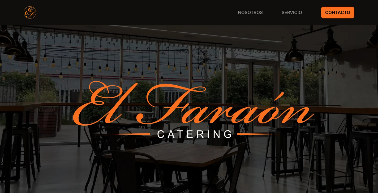
El Faraón Catering is a family business founded in 2018. It operates Telefe's dining rooms, serving between 200 and 300 people a day.
The daily operation was entirely analogue. The menu was shared through printed signs at the dining room entrance and WhatsApp messages. That meant printing again every morning, people missing updates, and changes during service, such as a dish selling out at 1 pm, failing to reach everyone.
The initial request was just a digital menu. As we started the project, it became clear that the brand needed work too: there was no defined palette, typographic system or version of the logo suited to a screen. Building a digital menu on that foundation would carry the same problem forward.
What we did
We split the work into three stages, in order: identity, menu and landing page.
The identity
The calligraphic logo and black-and-orange palette were non-negotiable for the owners, with good reason: people recognised them. Our job was to make the identity usable by defining precise colours, choosing a typographic system, creating versions for small sizes and documenting everything.
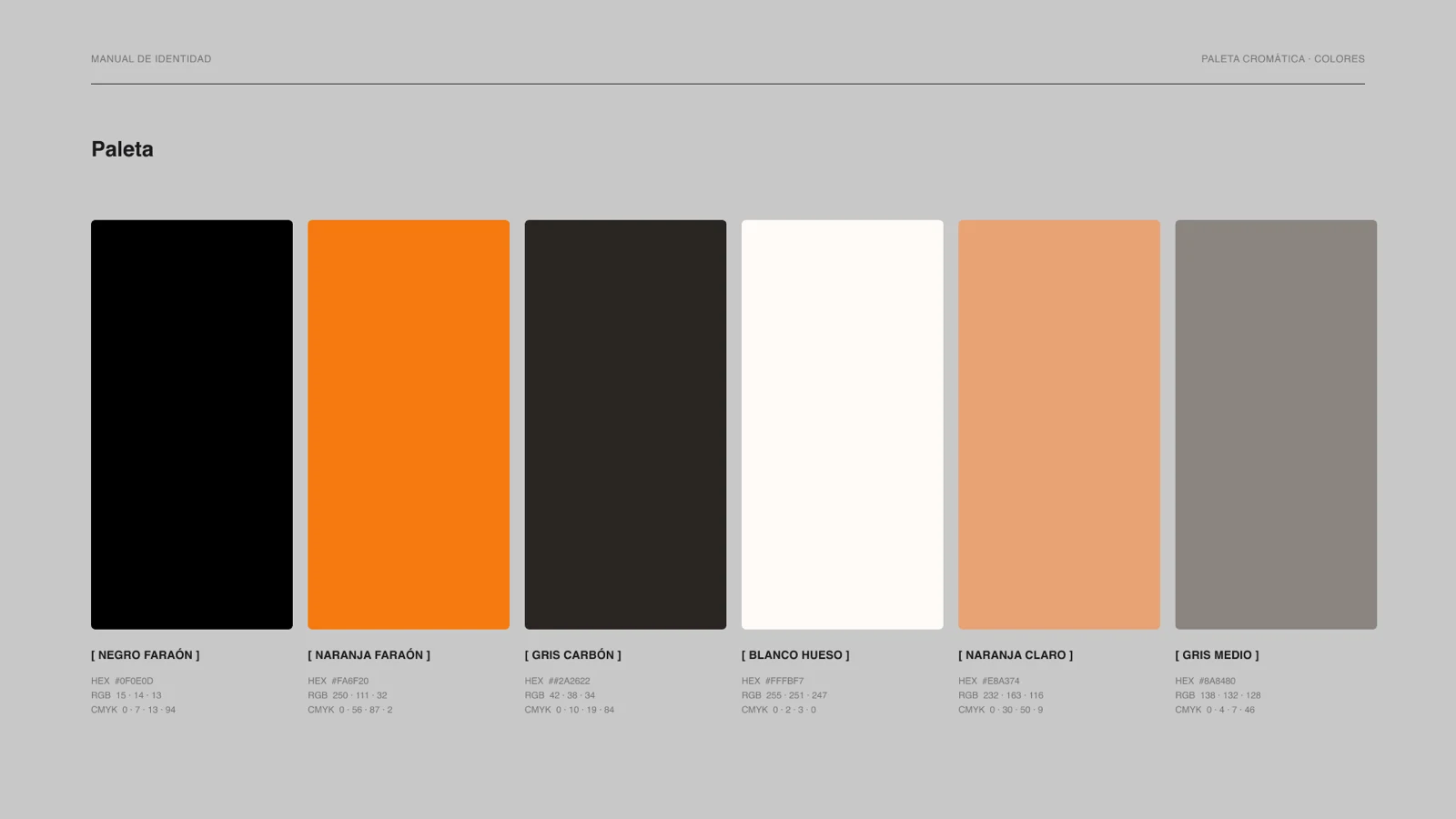
Two decisions shaped the system:
The symbol. The family voted for a four-dot option, one dot for each family member, which the presentation had proposed as a complement to the logo. Four separate dots did not provide a distinct symbol for a favicon, avatar or watermark. We reassigned the roles: the EF monogram became the primary symbol, and the four dots became graphic elements for separators, bullets and patterns. We respected the family's preference while giving each element a clear purpose.
Orange has a defined role. Instead of changing the brand colour, we defined combinations for different uses: orange as a fill or against black; black text on light backgrounds and white text on dark ones. The menu and landing page follow those rules, which is why the public menu uses a dark background.
The menu
This is the part used every day. A QR code in each dining room opens the day's menu on a phone, with nothing to install.
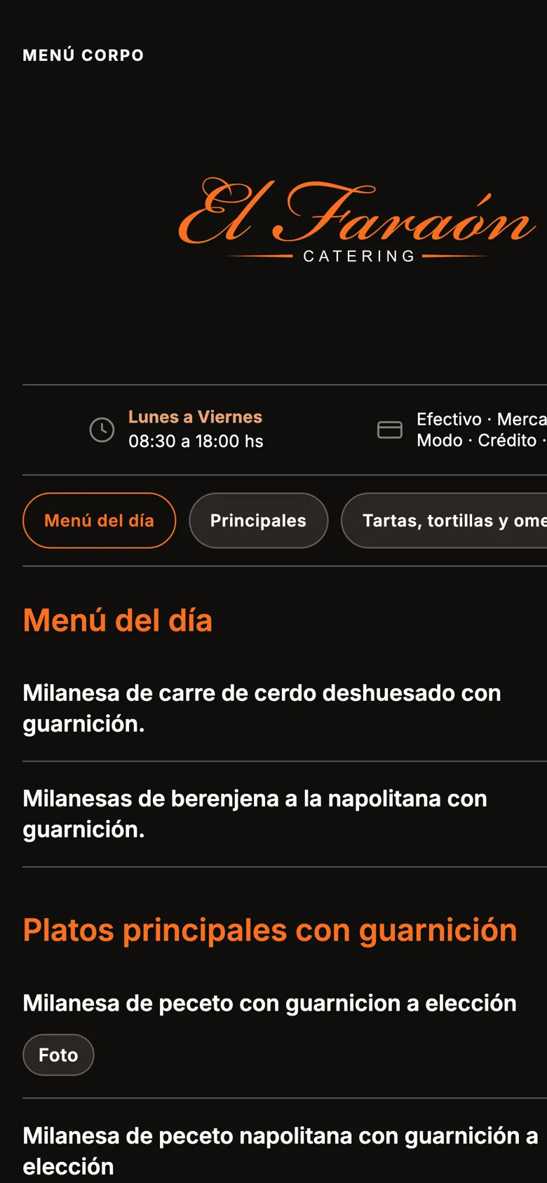
The key technical decision was to separate what changes from what stays fixed. The menu structure, including dishes, prices, categories and photos, is generated as static HTML at each build. Availability is updated live: when a dish runs out, the team can change its status without rebuilding the site.
That separation also helps the menu tolerate failures. If the database goes down, the page can still serve the content from the last build. A dining room serving hundreds of people should not lose its entire menu because an external service is unavailable at lunchtime.
The admin panel
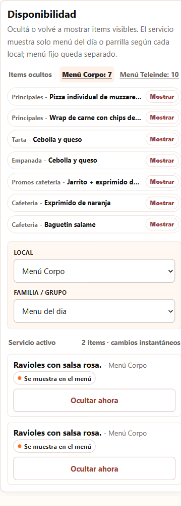
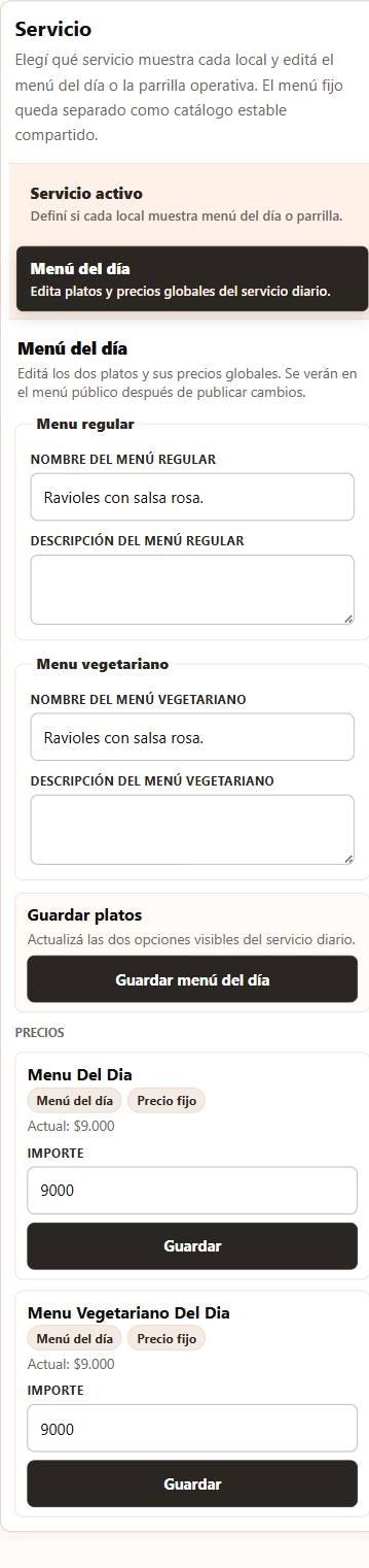
The aim was for the business to operate the menu without depending on us. Staff use a dedicated panel from their phones. They can hide or show dishes for each location, choose the active service and edit the day's regular and vegetarian options and their prices. Availability changes apply without rebuilding the fixed content; menu changes are published from the panel.
The result
The system is live and in daily use in the dining rooms. The institutional landing page, each location's menu and the admin panel share one identity, documented in a manual rather than in the memory of whoever designed the last piece.
We do not yet have measured results. The next step is to measure QR scans per dining room and day, how often staff use the panel without asking for help, and whether enquiries at the counter about available dishes decrease.
Technology
Astro, TypeScript, Tailwind CSS, Supabase, Vercel
What does your project need to solve?
Tell us how your business works and what you would like to improve. We can start with a conversation.
Let's talk